
Moscow Wayfinding Program
Complexity to clarity, mirroring elegance with form
The city’s vision is to build a world-class multi-modal transportation network to improve the experience of the city for citizens and visitors alike. To help realise the vision, Moscow Department for Transport (DOT) commissioned us between 2013-2015 to create a unifying visual identity and wayfinding programme to seamlessly integrate all forms of movement across the city.
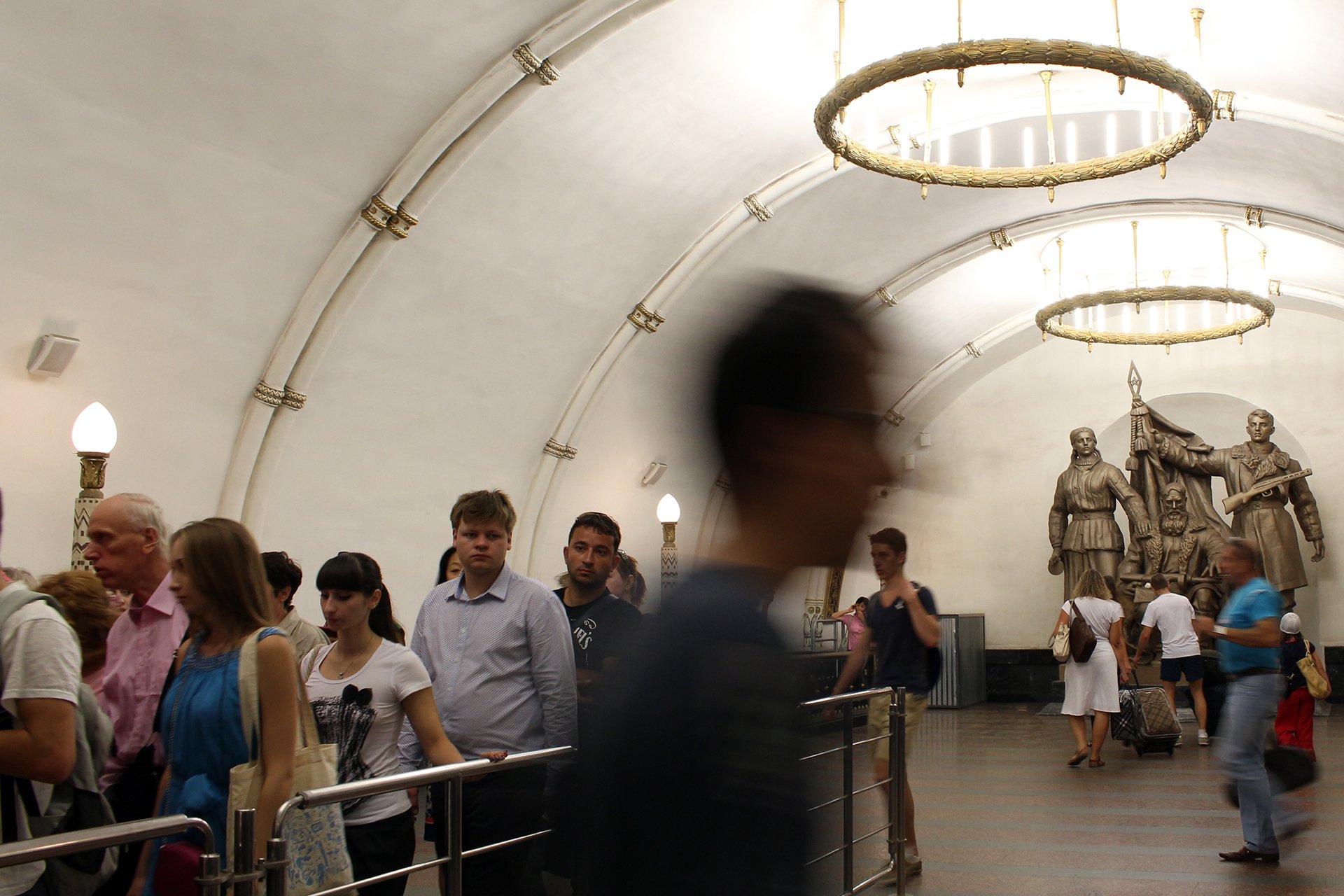
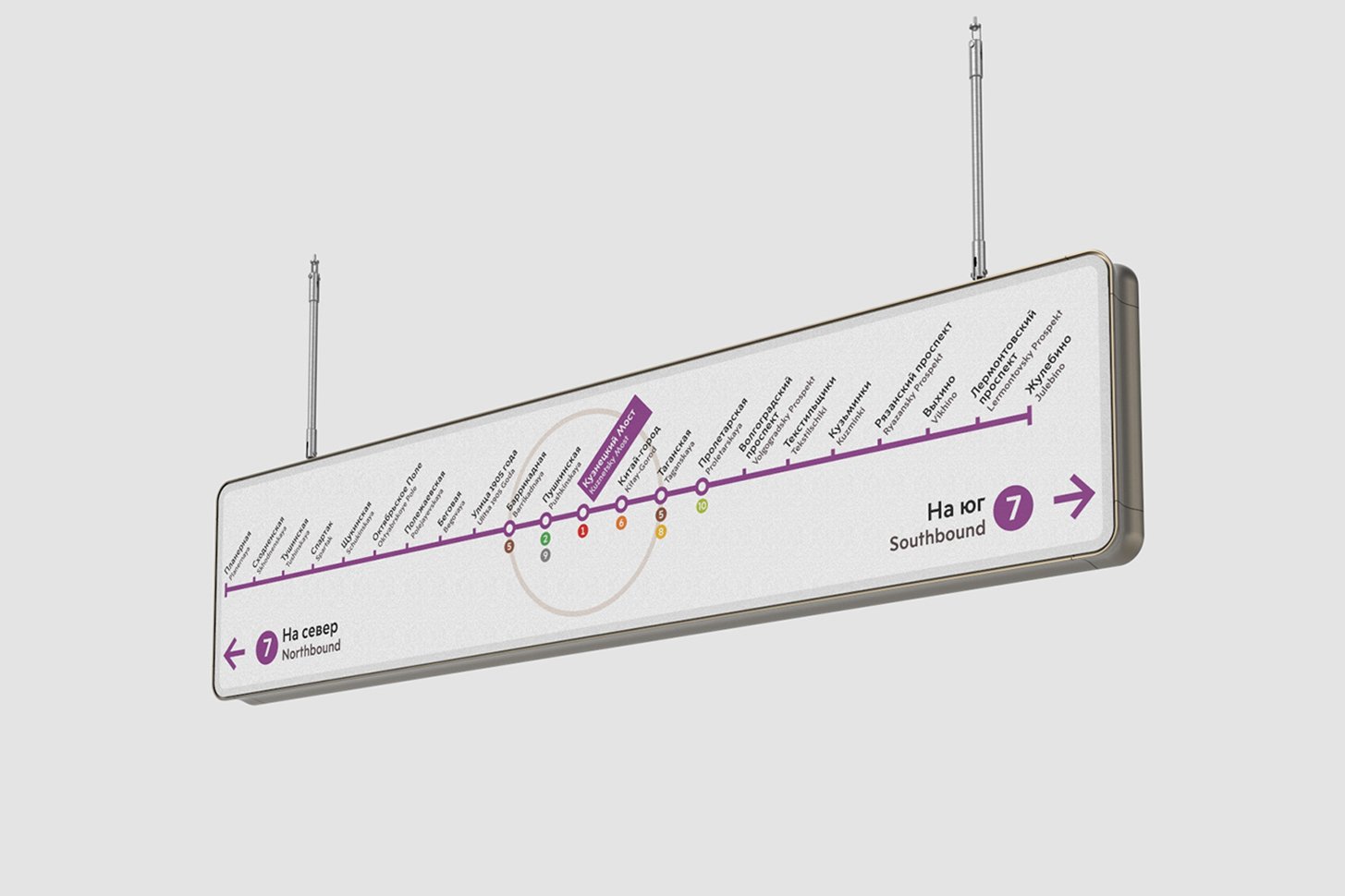
Commencing with the city’s iconic Metro system, the jewel in the crown of its public transit system that is used by 9 million people every day, we developed the concept, wayfinding strategy, information system and graphic identity to support greater connectivity and transfer.
-
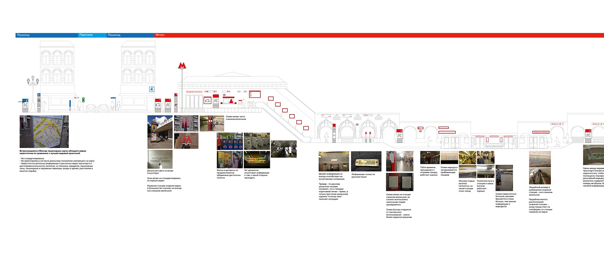
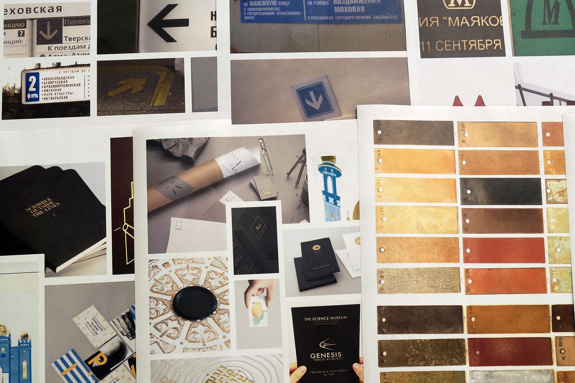
An analytical audit of the existing wayfinding provision in Moscow identified opportunities for an improved customer experience.
We collaborated with Billings Jackson to design a family of highly functional modular products for use across all public transit modes, for a range of internal and external environments. A key requirement was the development of a palette of materials that could adapt to the extreme environmental conditions of Moscow’s climate.
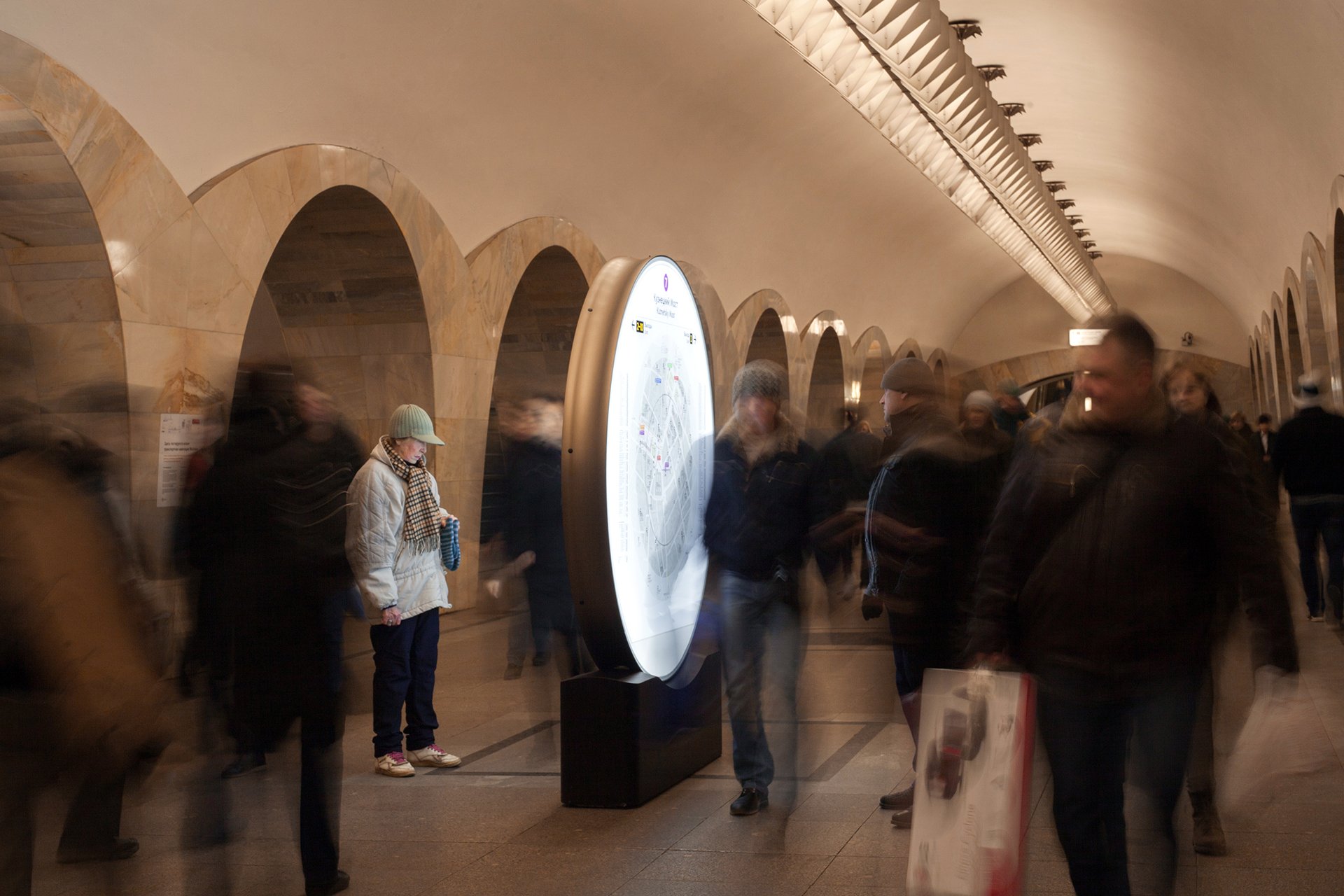
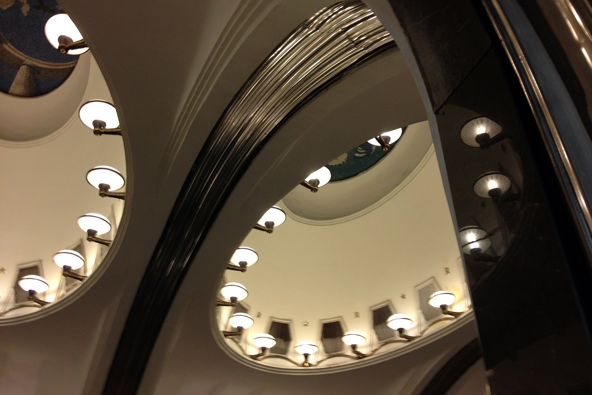
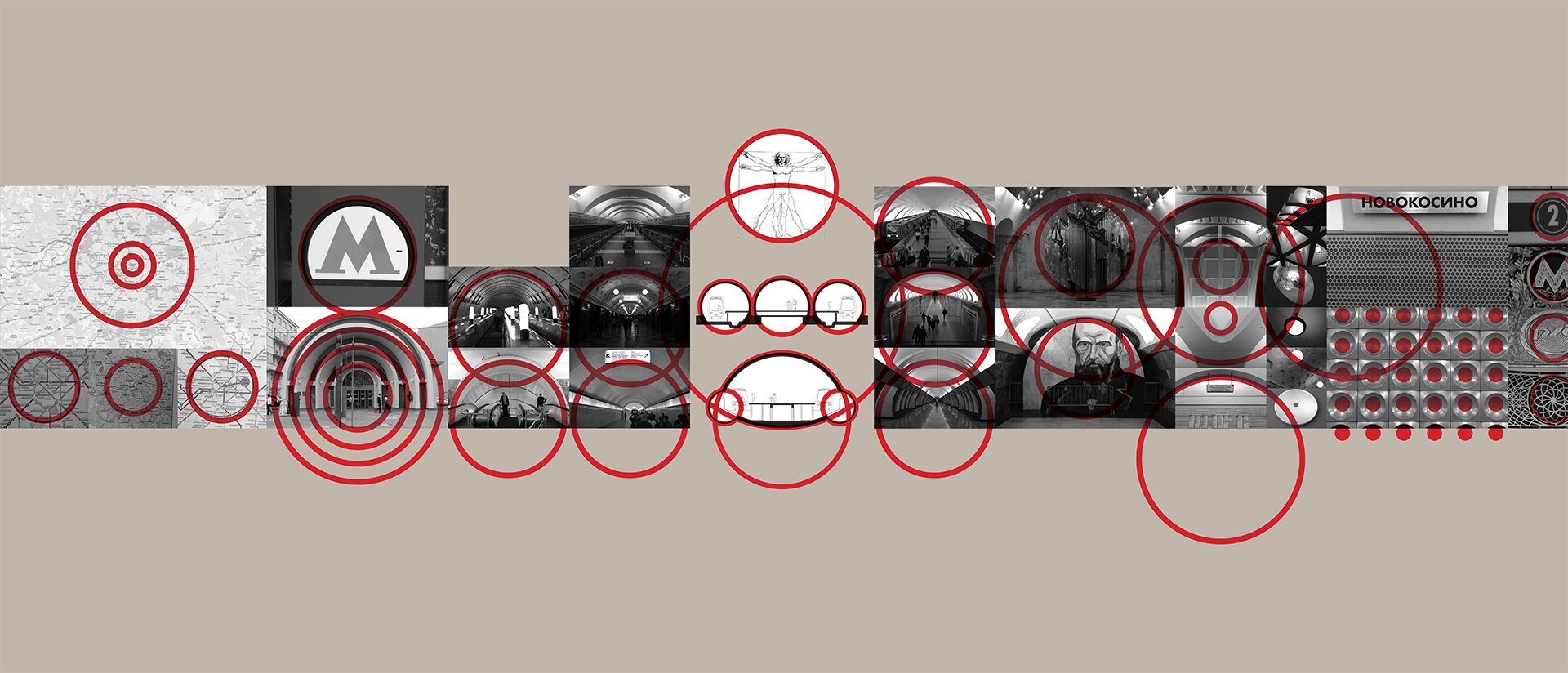
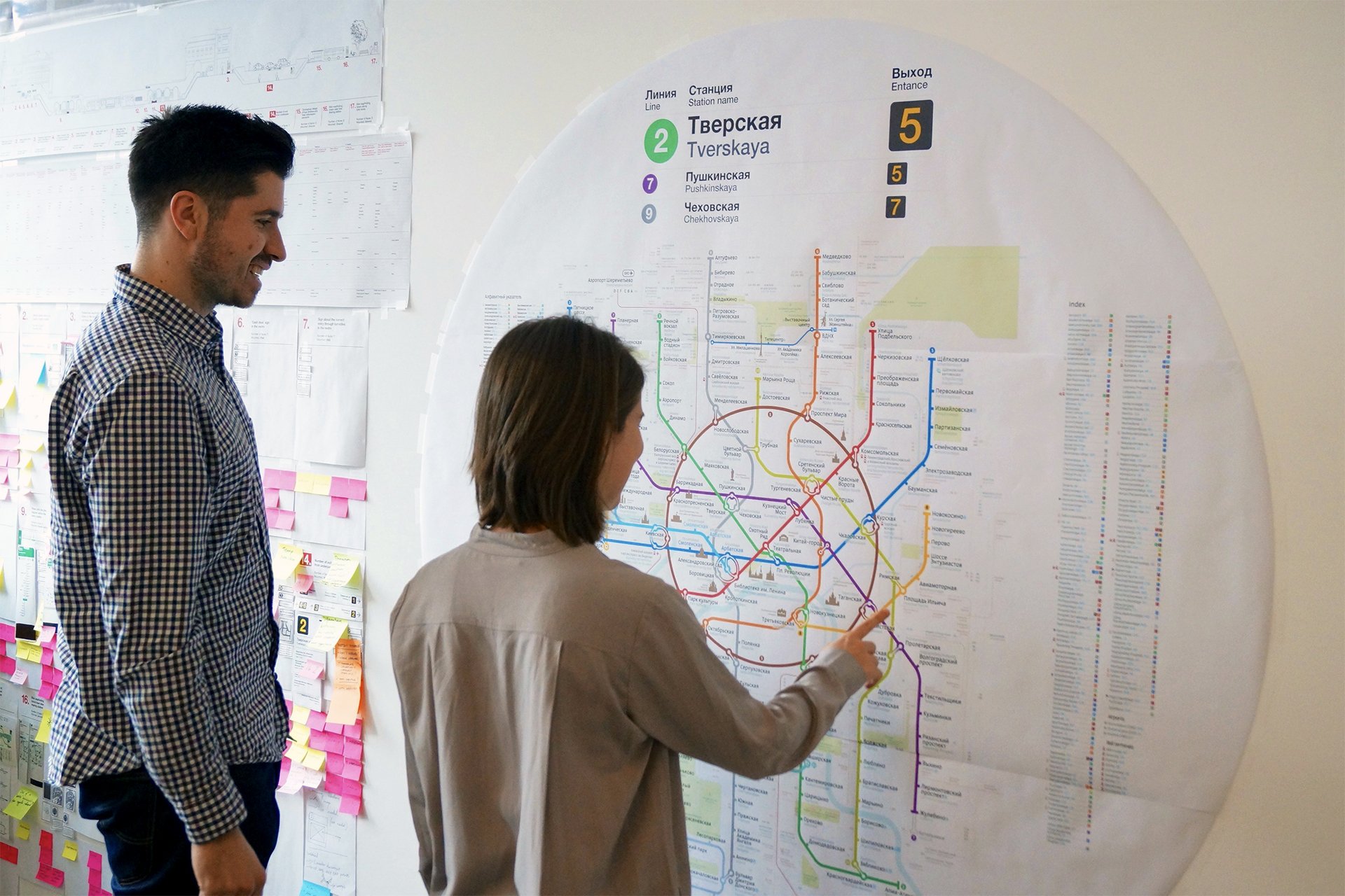
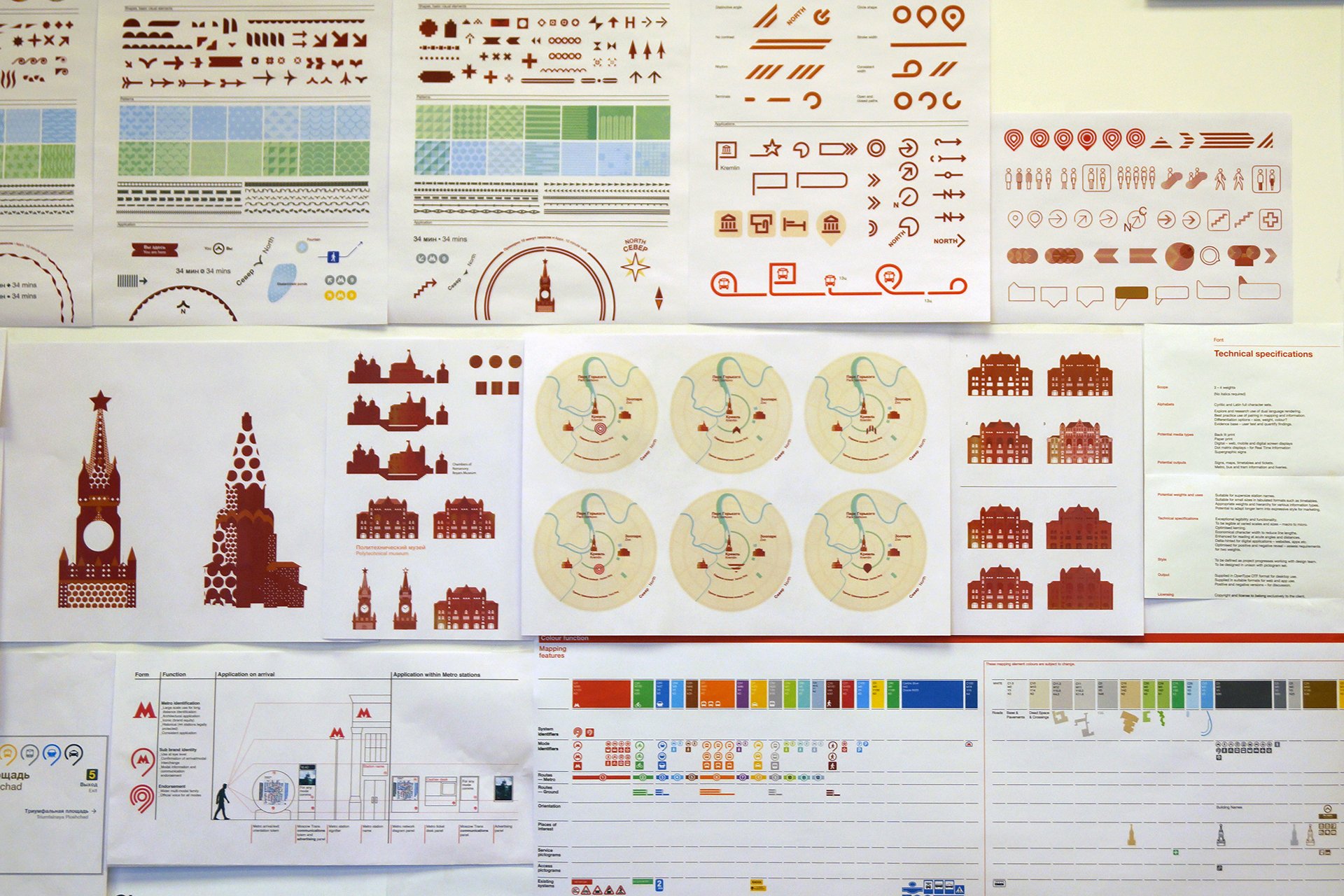
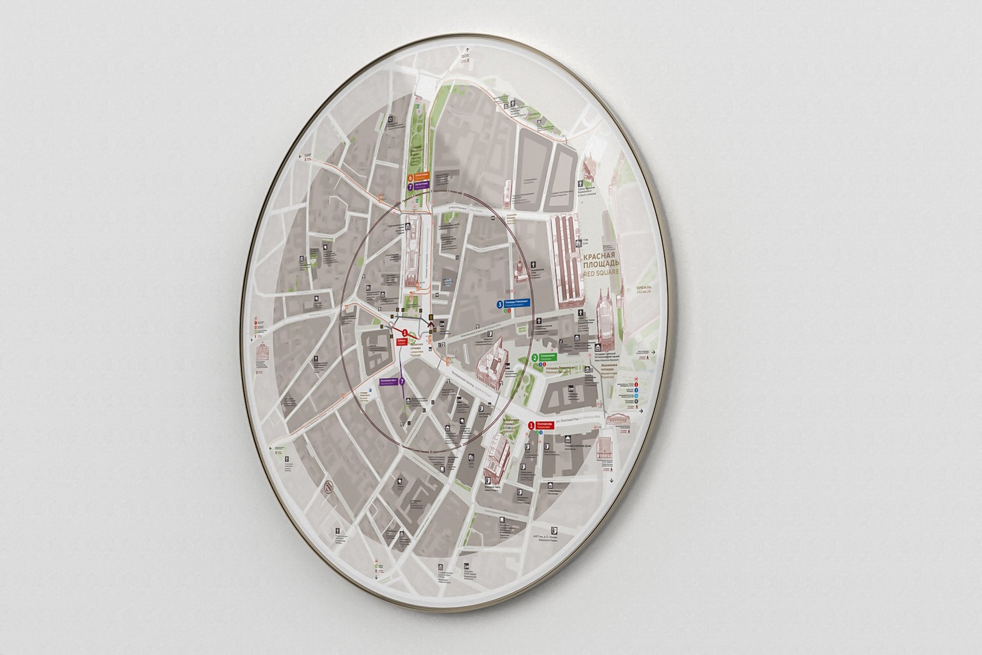
A responsive visual identity was developed as the voice of the system, inspired by and rooted in the DNA of Moscow. The circle, a consistent architectural form, is integrated as a signature component of the design language within the system.
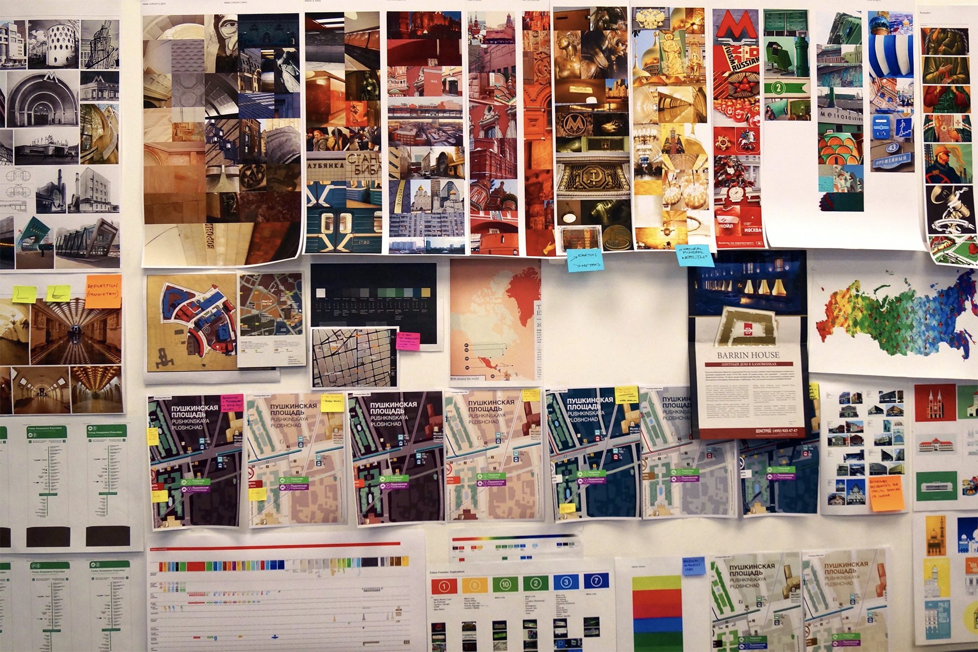
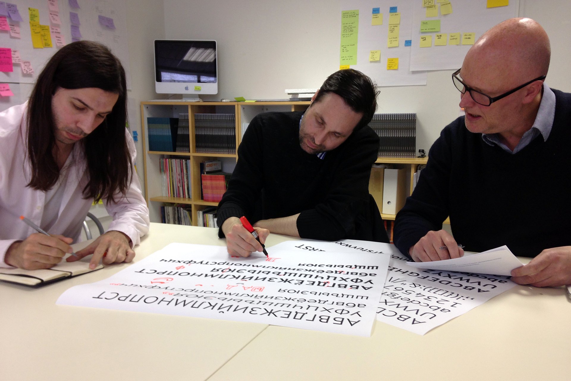
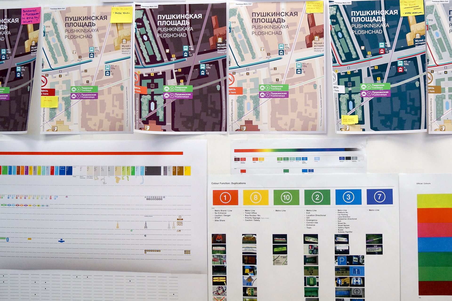
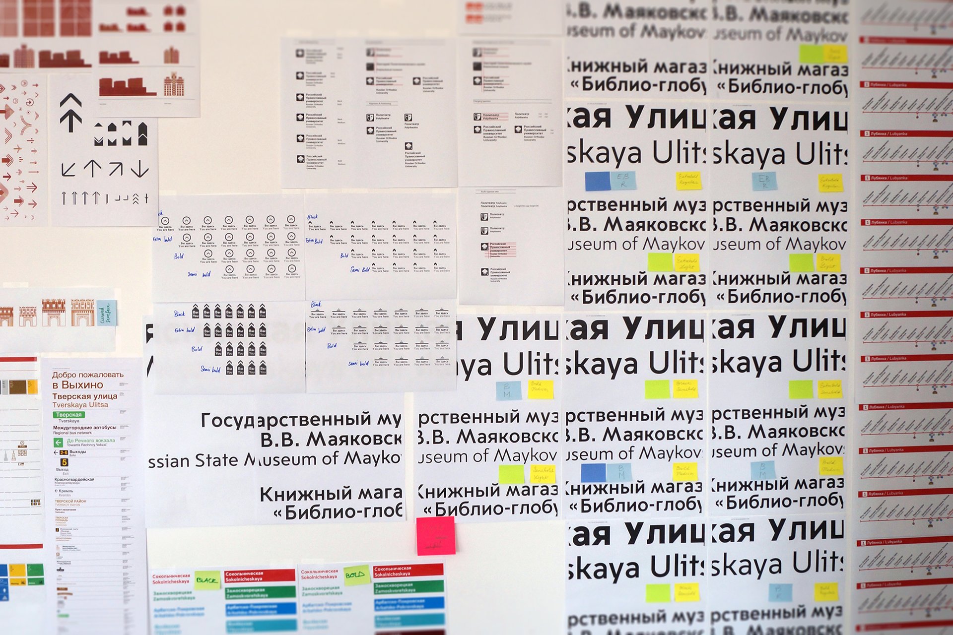
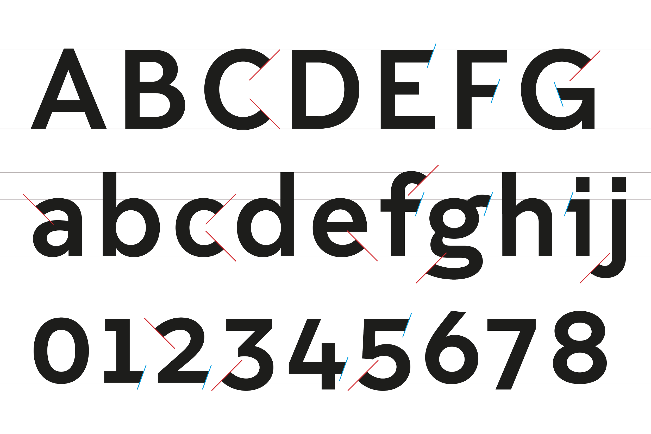
Grounded in the fundamental attributes of legibility and international recognition, a bespoke font of four weights, together with a comprehensive set of pictograms was created, alongside 2D and 3D building illustrations of Moscow’s top landmarks to aid navigation.
Project stakeholders and members of the public were consulted at various times throughout the evolution of the system, from mental mapping exercises to testing full-size product mock-ups in situ. Insight and feedback consistently informed the process to influence design decisions.
The system is being rolled out to all 190 of Moscow’s Metro stations, as well as other modes of transport including bike share, tram, trolley bus and bus – with bespoke shelters, real-time information totems and supporting street furniture.


Moscow DOT Client
City ID Wayfinding, Design and Direction, Cartography
Billings Jackson Design Industrial Design
A2-Type with Margaret Calvert Typeface and Pictograms
Ilya Ruderman Cyrillic Script
Ocula Illustration Outputs
Jason Clark Cartography Support
Lindner Group Product Engineering
City ID, in collaboration with Irina Koryagina, Misha Kvrivishvili, Daria Syuzeva and Michael Thomson.