Shrewsbury
Charm in expression, confidence in execution
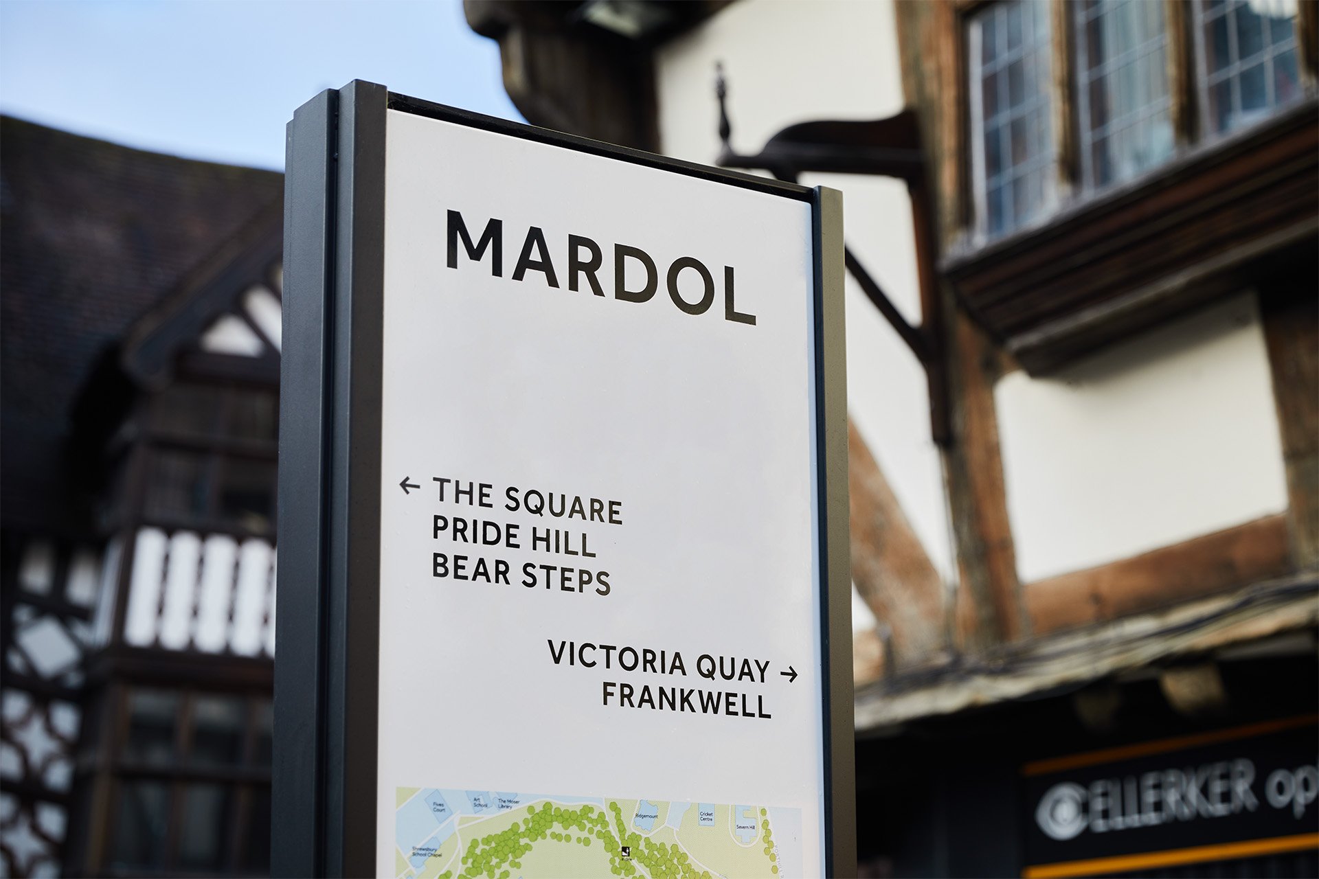
Building on Shrewsbury’s place brand and heritage, we evolved a unifying and distinctive design language for wayfinding. The design takes inspiration from the town’s rich history, character, and charm, to shape solutions that feel contemporary and confident, as well as firmly rooted in Shrewsbury’s story.
As an increasingly popular tourist destination, our goals were to improve the visitor experience, inform choices, and raise awareness of the many delights Shrewsbury has to offer. The design needed to strengthen the place brand identity, and complement the town’s revered streetscapes and vistas.
-
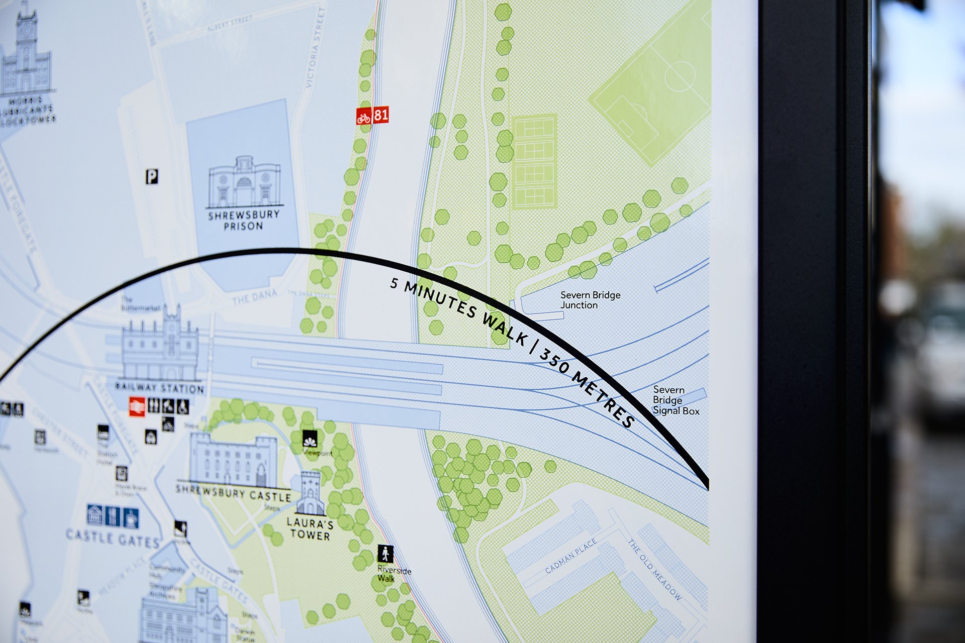
We worked in collaboration with the client team and local stakeholders to establish design principles, develop royalty-free maps and build consensus for the design approach.
Shrewsbury is home to the first iron-framed building known as the ‘grandfather of skyscrapers’. Product forms adopt the cruciform shapes that gave the first iron framed buildings their strength. The bold black frames contrast with off-white information panels, referencing the town’s celebrated Tudor architecture.
High-quality materials and finishes were selected to ensure longevity. Vitreous enamel graphic panels employ traditional screen-printing methods and craftsmanship.
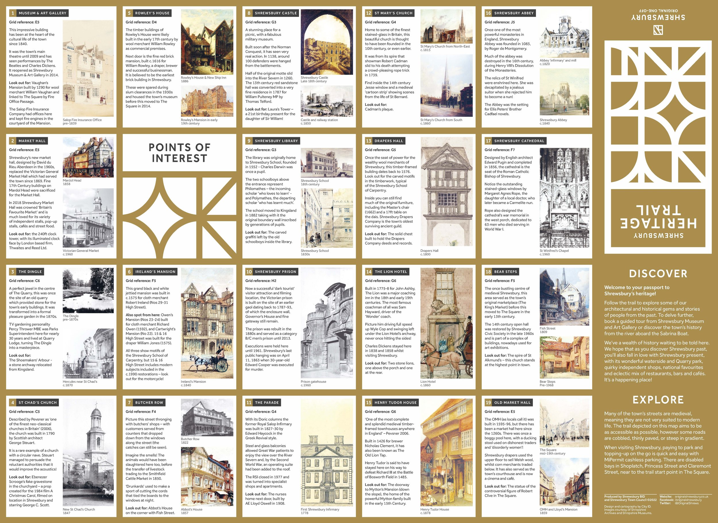
The project provides a growing set of design resources that have been used extensively by the Business Improvement District and others to promote heritage trails, active travel networks, businesses, and events – through both print and digital formats.
City ID Wayfinding and Design Direction
Andy Ruffell Consulting Industrial Design
Dalton Maag Typography
Trueform Fabrication and Installation
Notable projects
Town Centre Wayfinding
Heritage Trail Map
Active Travel Map


